The results
- 24Posters in the series
- 6 daysTo a full sell-out
- 120kFestival visitors
The story
The brief
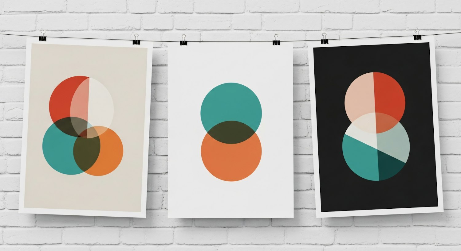
Overlap brings together artists from very different scenes for three days of collaboration. The organizers wanted an identity that felt like the festival itself: different worlds colliding and creating something new where they meet.
The idea
Every artist on the lineup became a circle with its own color. Where circles overlap, new shapes and shades appear, so every poster, ticket and stage screen shows a different combination. The system scales from a phone screen to a six-story banner without losing its playfulness.
- Identity system and color logic
- Series of 24 lineup posters
- Stage visuals and animated loops
- Merchandise and wayfinding
The result
The poster series became a collectible. Fans traded limited prints across the festival grounds, and the campaign drove the fastest ticket sell-out in the festival's history.