The results
- 2xFirst season sales
- 40kBoxes printed in year one
- GoldBrooklyn Design Awards
The story
The brief
Mochi Mochi started as a weekend market stall with a cult following and no brand at all. When the founders signed the lease on their first shop, they needed an identity as soft, playful and handmade as the pastries themselves, and one that could stand out on a busy Brooklyn corner.
The idea
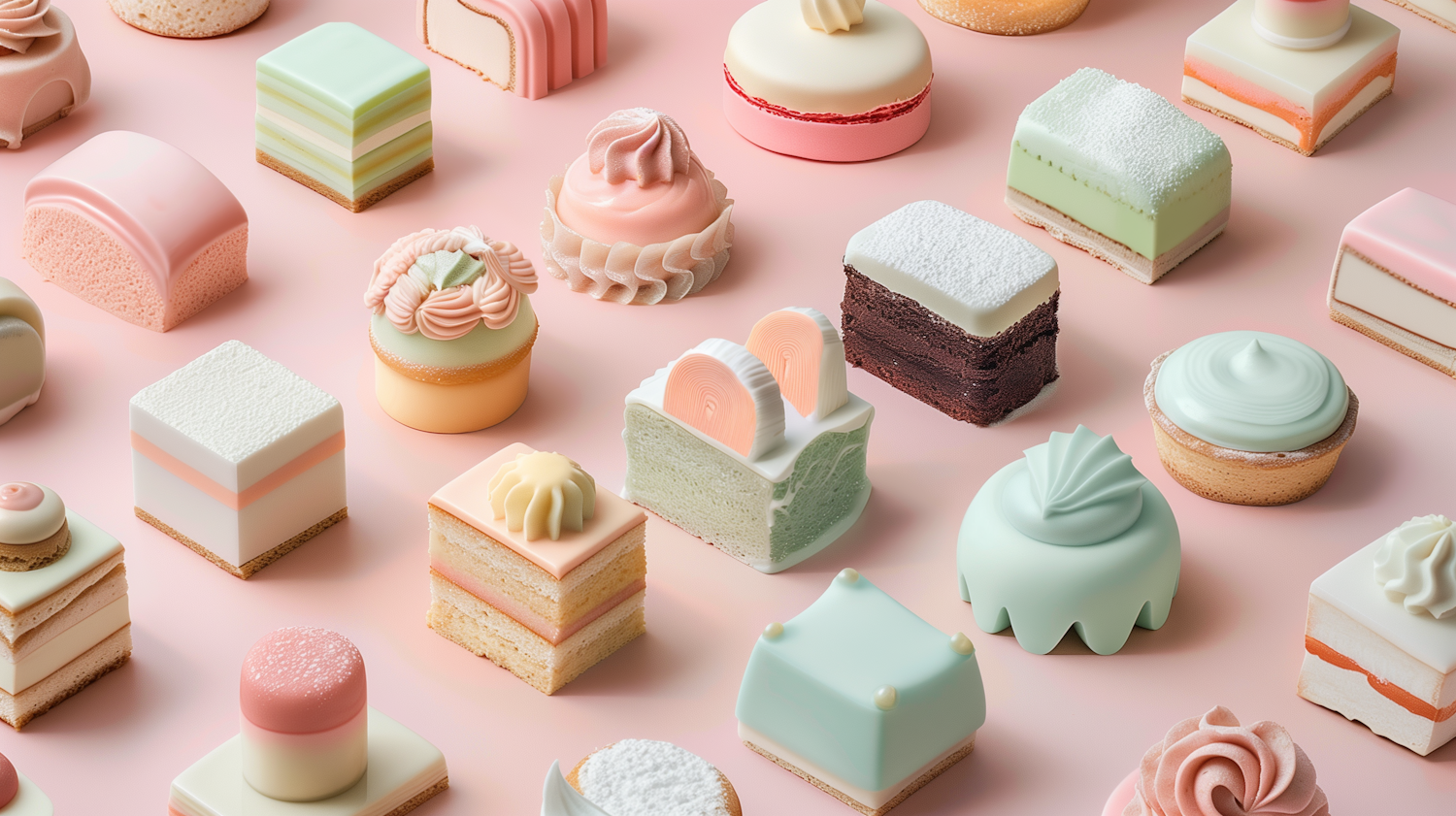
We built the brand around a cast of smiling pastry characters, each with its own personality and color. A rounded custom wordmark, a pastel palette pulled straight from the display case and a pattern of tiny faces tie everything together, from the shop sign to the stickers that seal every box.
- Custom wordmark and character set
- Packaging system for boxes, bags and cups
- Signage, menus and window graphics
- Launch campaign for social media
The result
The shop opened with a line around the block. Customers share photos of their boxes every day, and the characters now appear on seasonal merch that sells out every holiday.